Charting Choices & Definitions
In our opinion the charts you use should be as uncluttered as possible and only display the information and metrics needed for the type of historic and real time analysis you employ. Most members tend to be either trading a predetermined price blind, watching price action between rotations, and/or watching orderflow in real time to determine entry and exit points. We advocate using absolutely no TIME based chart patterns of any kind in intraday discretionary trading, nor do we advocate entering or exiting anywhere but at or near significant market structures visible and important to participants across a wide variety of time horizons and objectives. One of the first steps to trading like a pro is to let go of what we call the ‘time based pattern trap’. That said, we are not trying to take your charts away from you. You should watch price in whatever way works best for the way you trade and in whatever periodicity suits you, but your charts need to become guides to find where opportunities are, not used to identify patterns specific to a time frame. In other words the idea is to see the market for what it is, an auction, rather than seeing the market as a pattern on a chart.
Since 2010, and until recently the DTG founders had used MarketDelta charts which were a white labeled speciality version of Investor R/T. In late 2016, MarketDelta (the company) changed their charting platforms from Investor/RT to a sophisticated CQG charting and trading platform. While we’re sure the CQG platform is very good and the change is a good strategic change for MarketDelta (the company), the change was disruptive for DTG members and would have created a loss of DTG functionality (namely the automatic display of DTG levels on Investor/RT charts). So from December 2016 until September 2019, we elected to take the least disruptive route and remain on the Investor/RT charting platform. The previous MarketDelta footprint is replaced by similar functionality in Investor/RT called VolumeScope. As of October 2019 for a variety of reasons including more and more members switching to the far lower cost and similar functionality of Sierra Chart, the founders have switched to posting the daily educational Example materials via that platform. However, for members still using IR/T we will continue to upload the EDI files to our server so that the levels from the daily plan worksheets will auto-populate into their charts.
In any case if you want to trade like most members intraday you will need either Sierra Chart with the service pack which includes their Numbers Bars functionality, Investor/RT, MarketDelta Footprints via CQG’s frontends, or Ninja Trader with the AMS tools plugin, or some other software which organizes historic prints in a similar way. These tools present a TON of information that you can become overwhelmed with if you allow that to happen. But you will see how most of our members cut through the vastness and get at only the key stuff needed to see what is important. I know there are lots of charting and execution options and some are cheaper than others – even free. But whatever option you choose in our opinion you simply must have the ability to see the level of granularity that these tools provide if you are trading futures short term intraday – in whatever market(s) you trade. It’s no longer an “extra”, it’s the new standard in our opinion. There is always the option of using the DOM & tape though it will be much harder for you to remember what has happened recently. [EDIT: scratch that. A guy named Peter Davies has since come along and created the solution to the order book activity “memory problem” with the Jigsaw Tools. More information at jigsawtrading.com]. Since then though these tools have become an industry standard just like Footprints have and the same orderbook detail functionality is now integrated into Sierra Chart as well. In any case whatever software tools you choose, just make sure they allow you to see the aggressive prints at both bid and offer at every price as well as the ability to filter by trade size as well at an absolute minimum. You also need a good way to plot total volume at price. Each of the aforementioned software packages are able to do that outside the realm of Market Profile directly on a chart which most members find mandatory as well.
Sierra Chart Chartbooks
Scott of Orderflowsolutions.com developed Sierra Chart templates to match most of the chart layouts described below. Scott charges a small fee to use the templates For those interested in the pre-built Sierra Chart templates, the following blog site has been created to access the files. The site is exclusive to the DTG community as it is hidden from search engines.
Any questions about the templates or Sierra Chart in general, feel free to ask Scott:
Sdtatman@gmail.com
Orderflowsolutions@gmail.com
Chart Types
Most members use just 3 chart types (for intraday analysis that is) which show us everything we need to know from a broad sentiment picture to timing entries and exits. Each of the founding members has slightly different chart definitions set to his own taste. We use no indicators other than total volume, volume at price, the VWAP, volume footprints/price statistics, and of course the resting orders in the book on both sides as well as tracking changes to the orderbook. NO LAGGING INDICATORS of any kind. In our view anything that has an adjustable parameter is pretty much worthless. History is just that, history. It does not fortell the future. In our opinion if you want to be successful, you MUST let go of thinking that specific time frames or chart layouts or any of this stuff means anything to your results. Your process should be like this: Figure out what you want your charts to help you see, then try a few things until you land on what helps you see it best. As an example, order flow can be read from minute, tick, volume, range, or point and figure plotted price feeds. Any of them will technically give the same info. But as a basline for the ES we find a 6 tick reversal aka PNF bar plot to be a good standard that shows the natural push and pull rotations as we call them in that market intraday. The idea is to find what’s easiest to see what YOU want to see, which for us is the natural speed and cadence of the price action. All markets ‘push’ up or down and ‘pull’ back continuously. Hence why we feel point and figure plotting is most natural. But as always, find what’s best for you and your strategy specifics. Do your own thing instead of trying to copy others and you will get more out of it. Think about what YOU want instead of just following someone else. Even in our own group, one of our members likes the 5M with volatility bands to spot exhaustion blow offs and yet another prefers a blindingly fast 144T chart for entries to see price action changes. It just shouldn’t matter if you are seeing things in the correct perspective.. Whatever lets you see what is happening around key prices the best so you can figure out when to pull the trigger – or not. This said, if you are fairly new to trading or just want a fresh start you are welcome to use our charts.
If you are a Investor/RT user you can import sample chart definitions similar to what most members use below. We’ve included both a white background and black background (Noir) version of each so you can even switch them up from time to time to prevent boredom and eye fatigue. Feel free to alter color choices to your personal choice. For simplicity sake we’ve only included ES specific definitions here, but each of these can be easily modified for use in other markets with a few minor changes.
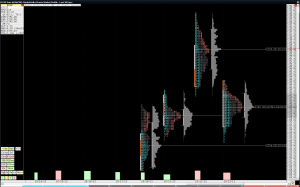
– The “Candles” charts are what we use the majority of the time for pre-session consideration of historic market structure to choose potential entry/exit zones. We also use it for monitoring the market in real time other than timing entries and exits. There are three key menu buttons in the upper left hand corner. The session button is for toggling between displaying just the RTH session and the full Globex session. Obviously the session numbers can be changed depending on which market(s) you trade. The time button includes a complete list of peridocity choices meaningful to us including 4-12 tick reversal bars, 1-6 renko bars, 1-240 minute bars, plus daily/weekly/monthly bars. As previously mentioned we are always efforting to remove time from decision making and the range of choice in the menu allows us to scroll through basically all the periodicities to ensure that key price zones are shared by most all of the timeframes viewed by the majority of market participants. The Fibonacci button allows for quick plotting of fib retracements and extensions with the drawing tool between any two swings. While we don’t use fibs for any absolute decsion making we do like to use them for help in framing likely high low ranges for the session as well as projecting new all time highs or lows when there is no prior price or volume to use. We also use the classic floor trader pivots not as an indicator to identify potential trade locations, but as a guideline for relative range of motion compared to the previous day. Finally, the volume profiles are split into three parts for easy division of the full Globex session at a glance. There is a plot for the 9:30-4:00 cash market session, a plot for 4:00 to the Globex close at 5:00, and a plot for the overnight session from 6:00 till 9:30 the following morning (all times mentioned are EST).
Investor/RT ES Candles Definition
Investpr/RT ES Candles Noir Definition
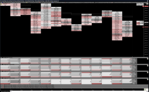
– The “Orderflow” charts created with AMS DeltaPrint are only used for real time monitoring of the market specifically for stalking entries and exits. The menu button in the upper left hand corner allows for selection of 4, 5, 6, 8, 10, and 12 tick reversal periodicities. As previously mentioned we only monitor markets using reversal bars intraday. For the ES we generally use 6 ticks in typical volatilty conditions but sometimes use 4 ticks for either very contracted conditions or for scalping. In significant volatility expansion we sometimes find 8 ticks shows the market activity best and in extreme volatility conditons such as in the fall of 2008 as much as 10 or 12 ticks may be needed. For convenience the key metrics of overnight high and low, prior session close and prior session high and low are plotted as session statistics. The broad market is plotted with bid/ask footprints in the main window and the pullback data price statistics on the far right shows the volume at bid and at offer since the last high or low in real time. Also shown in the main window are the floor pivots, the VWAP plotted with the grey hollow price boxes and the VPOC plotted with a rectangle around the single highest price in each bar. Additional volume filtered instruments are also added to the chart but plotted as invisible and closed out at the bottom of the chart. The purpose is simply for them to drive the additional volume filtered bar statistics to have a better idea of what bigger traders are doing. The broad market statistics are shown on top with the activity greater than 25 lots, 50 lots, and 100 lots “laddered” underneath with the key metrics we use regularly plotted the same way in each.
Investor/RT ES Orderflow Definition
Investor/RT ES Orderflow Noir Definition
InvestorRT now has “OrderFlow” charts native. The functionality is called VolumeScope and is an add on for InvestorRT. Below is a chart template similar to those above using VolumeScope.
Investor/RT ES OrderFlow (VolumeScope) Definition
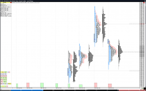
– The “Market Profile” charts are just that. Traditional plotting of price using the CBOT licensed Market Profile method. We primarily use this chart in conjunction with the “Candle” chart to better see how volume develops throughout the day. Whereas the “Candle” charts are usually set to display the full Globex session, these charts are almost always set to display the RTH session only. Profile letters are grouped by color to clearly delineate the first half hour of the cash market open, the remainder of the morning up to the European close, the lunch time doldrums, and the last hour into the cash close through the final Globex close. We use these charts to watch the opening push of the cash session closely as well as how the balance/value areas and closing prices are moving relative to prior sessions to form directional biases. Its also the most convenient way to see any naked VPOC or virgin single print structures. Finally, rather than clutter up any other charts we plot the total volume per session here and can see whether its delta negative or positive which we also may use for pre- session directional biasing.


